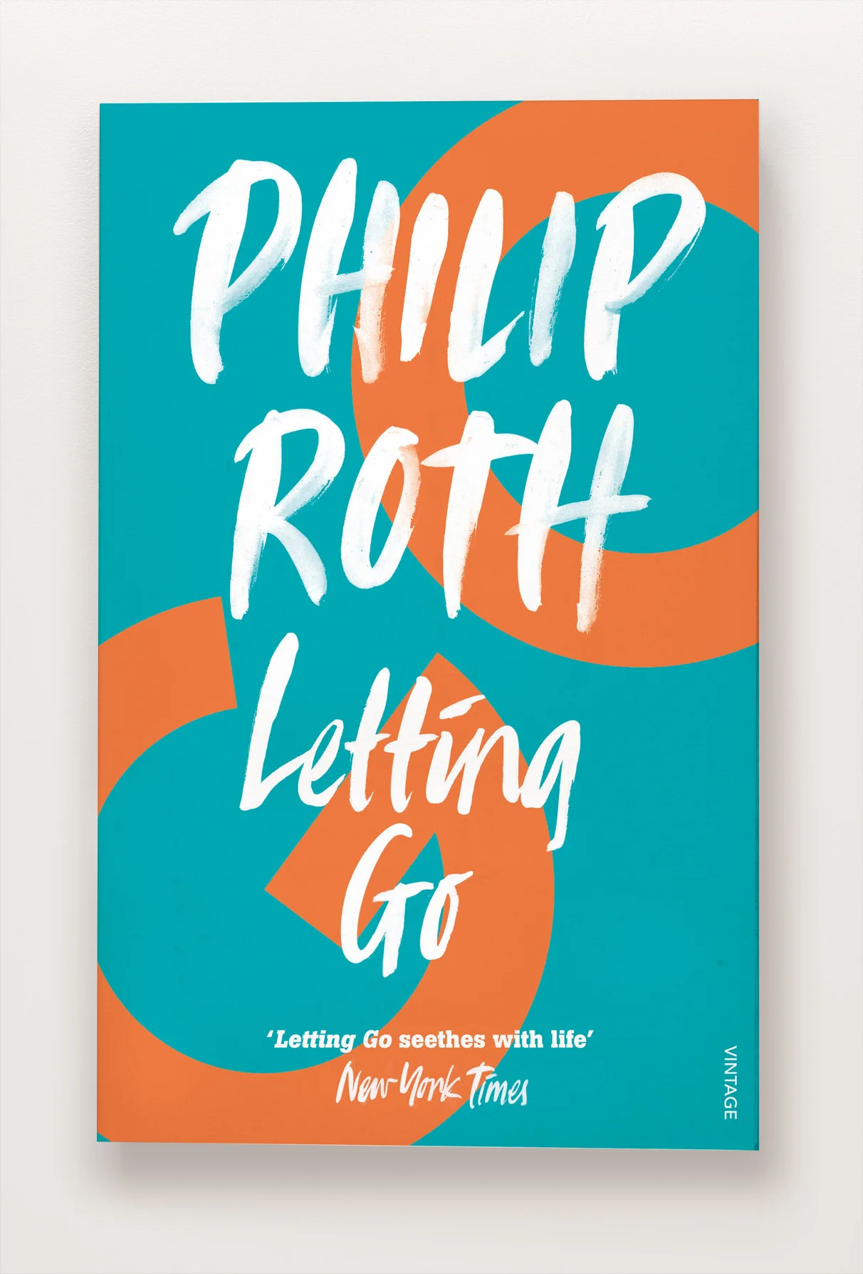
This was a lovely series to work on. I'm a big Roth fan and wanted to apply the beauty and simplicity of his prose to the design. The result was to pare each title down to a single letter - sometimes an initial, sometimes two, sometimes punctuation. Bold, authoritative and playful was the aim.
And here they all are - (Portnoy's Complaint aside). 31 titles makes for an irritatingly grid system so Portnoy's took centre stage as the head image. Many thanks to the wonderfully talentedl Ulla Puggaard for the hand lettering.


